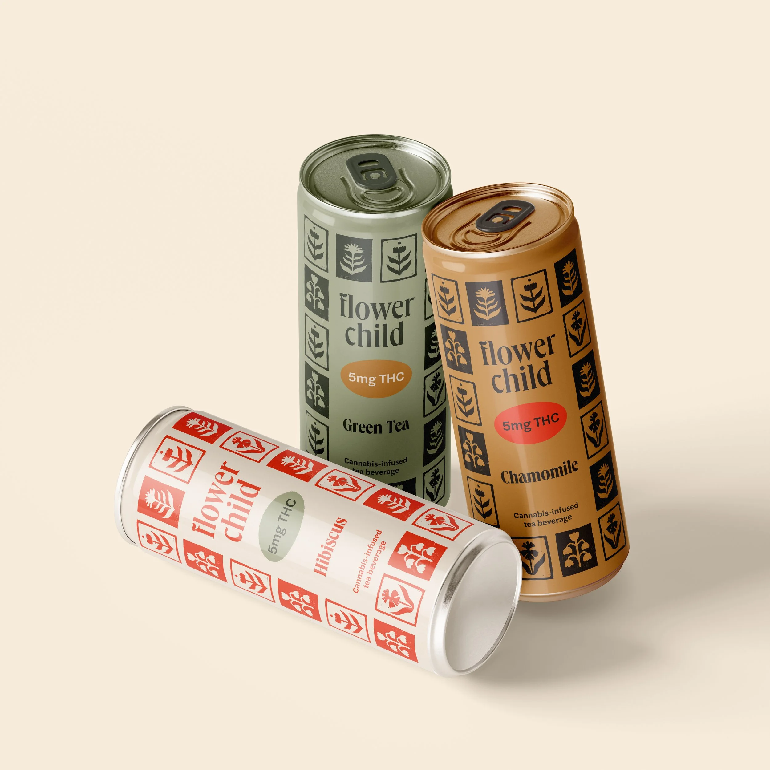
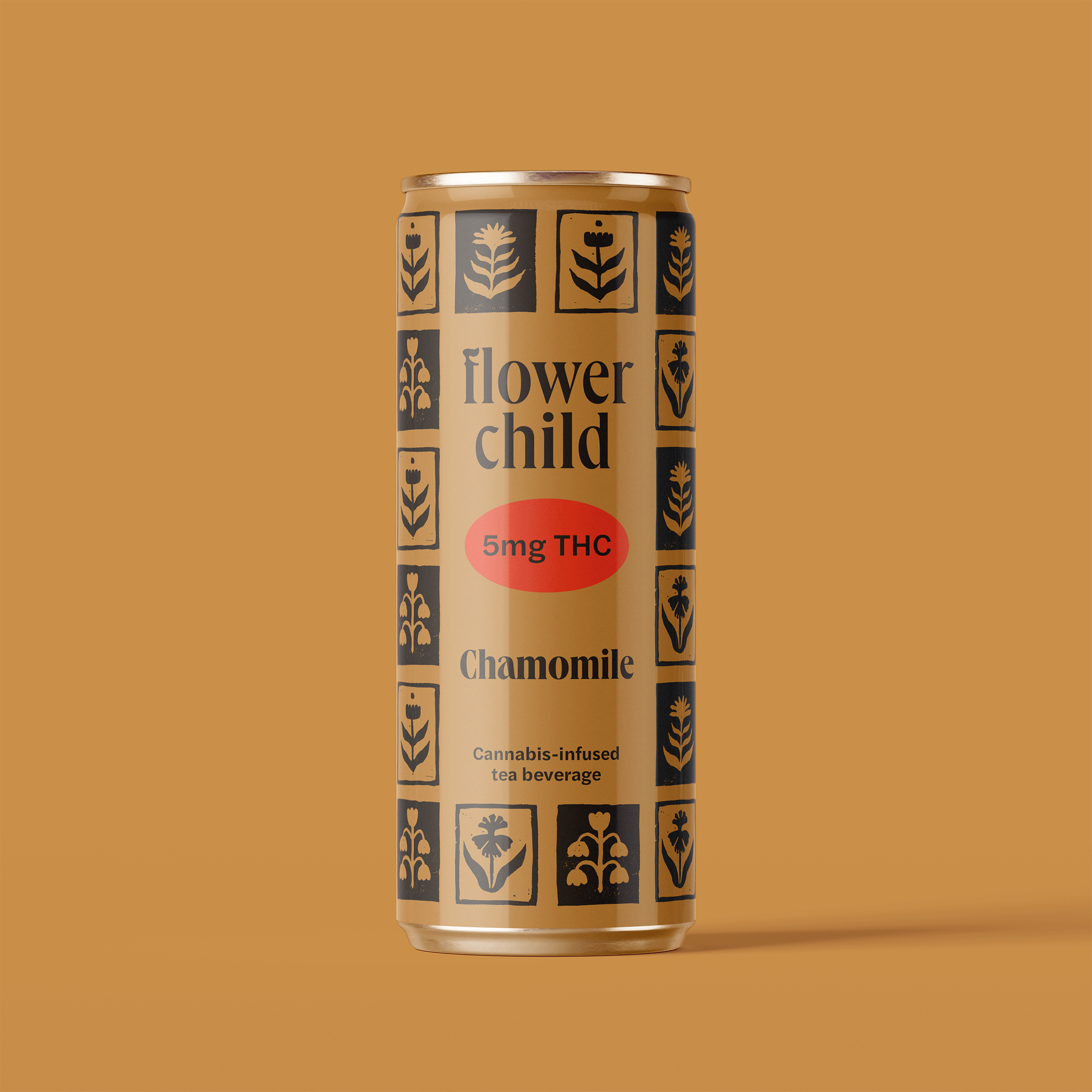
Flower Child
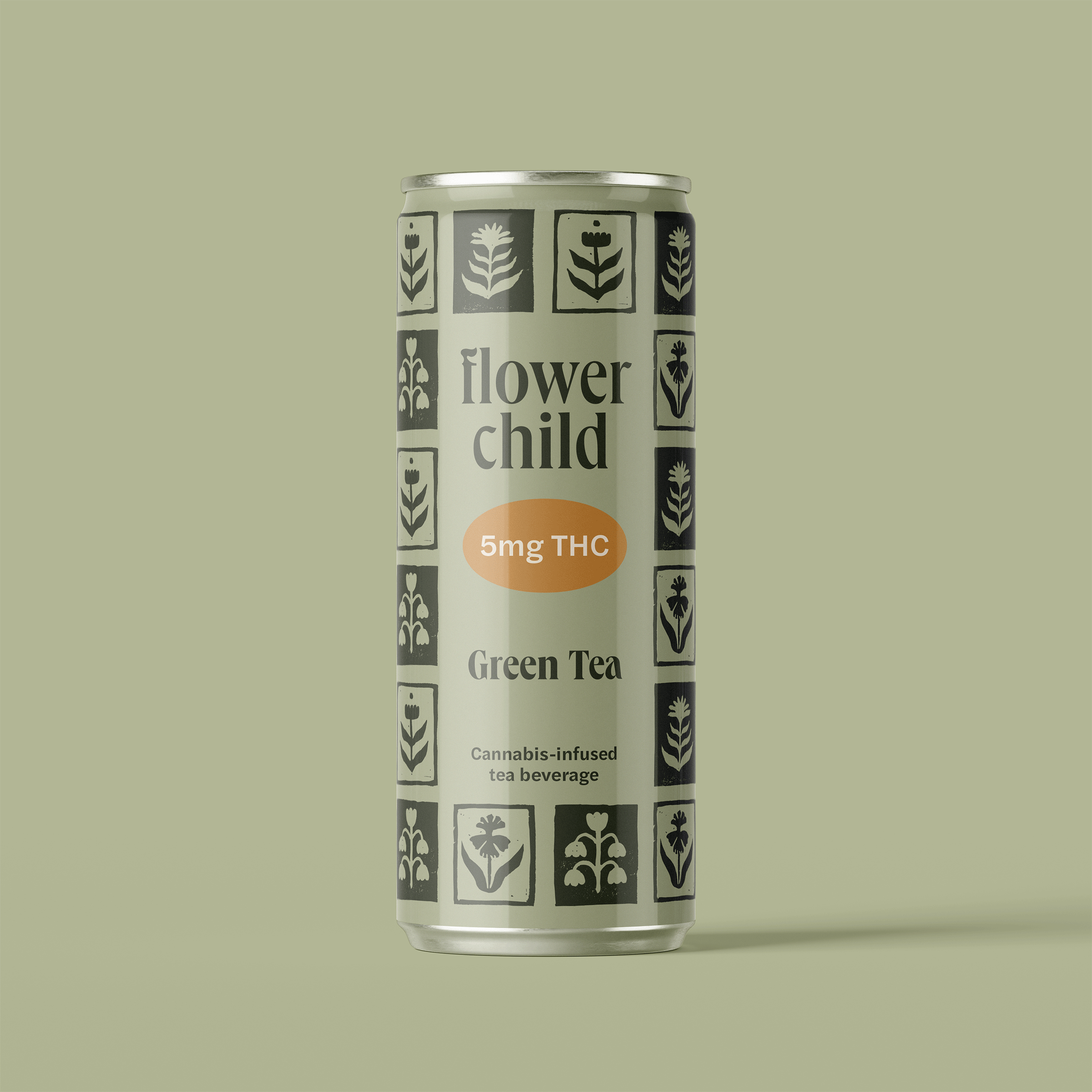
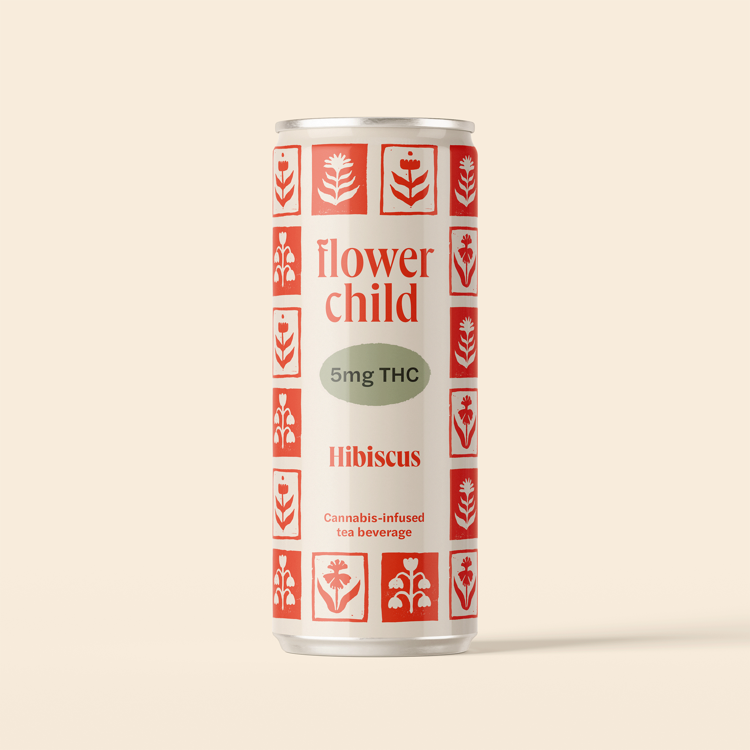
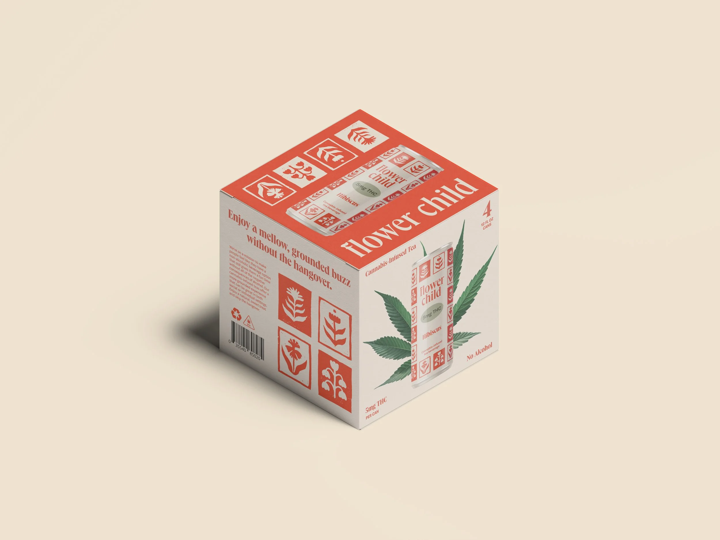
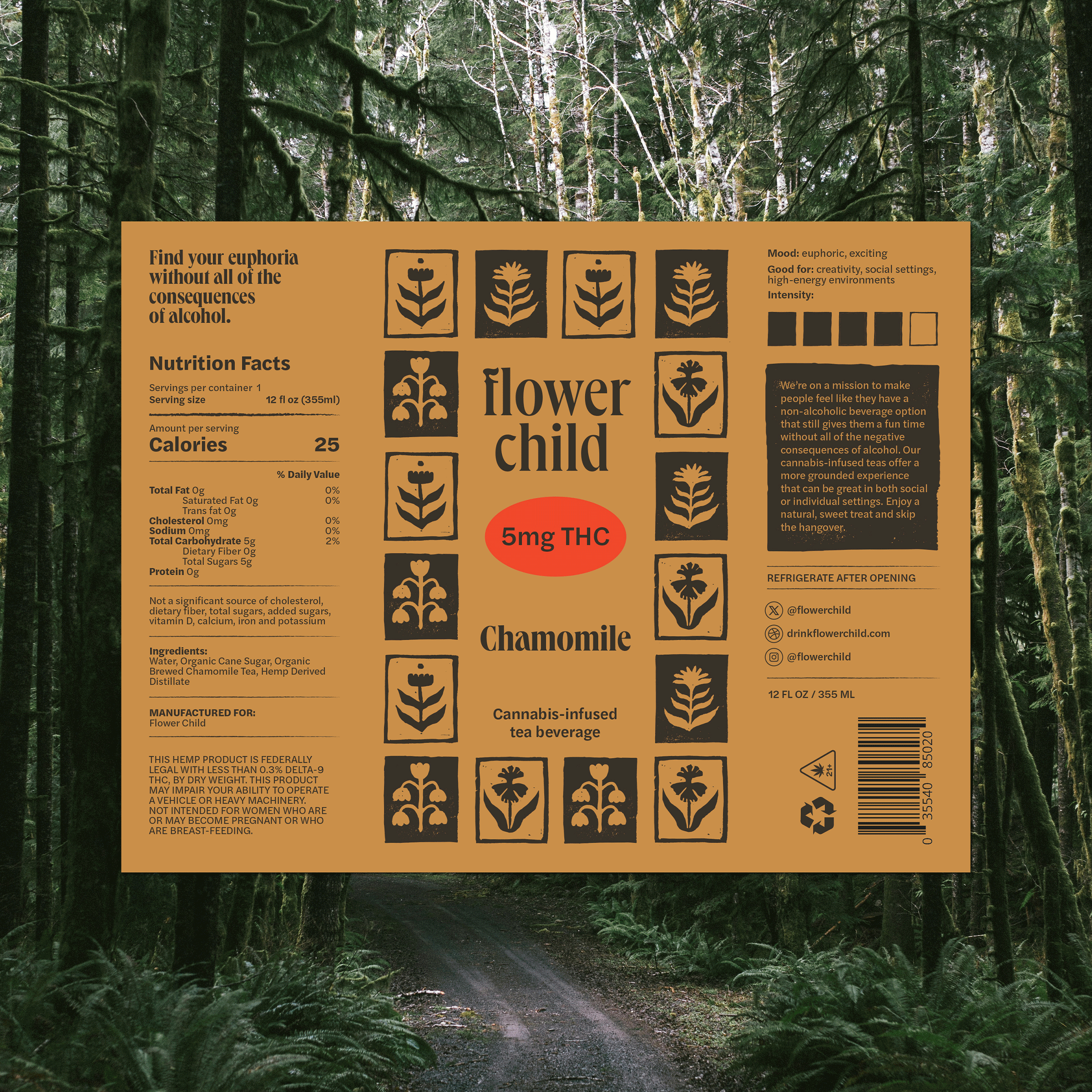
Flower Child, a conceptual brand, is a counter-culture canned THC beverage offering a grounded, hangover-free alternative to alcohol. The goal was to create a visual brand identity, focused primarily on packaging, that could stand out in a growing market of canned nonalcoholic beverages.
The creative solution was to focus on a “granola” audience — one that enjoys being in nature and feeling grounded over going out and drinking alcohol. The earthy colors, tea-based flavors, and floral elements target the outdoorsy demographic, while conveying the more mindful and chilled-out buzz you get from Flower Child THC beverages.
Visual Identity Design Brand Strategy Illustration Packaging Design Printmaking
Role: Art Director, Designer, Strategist, Illustrator
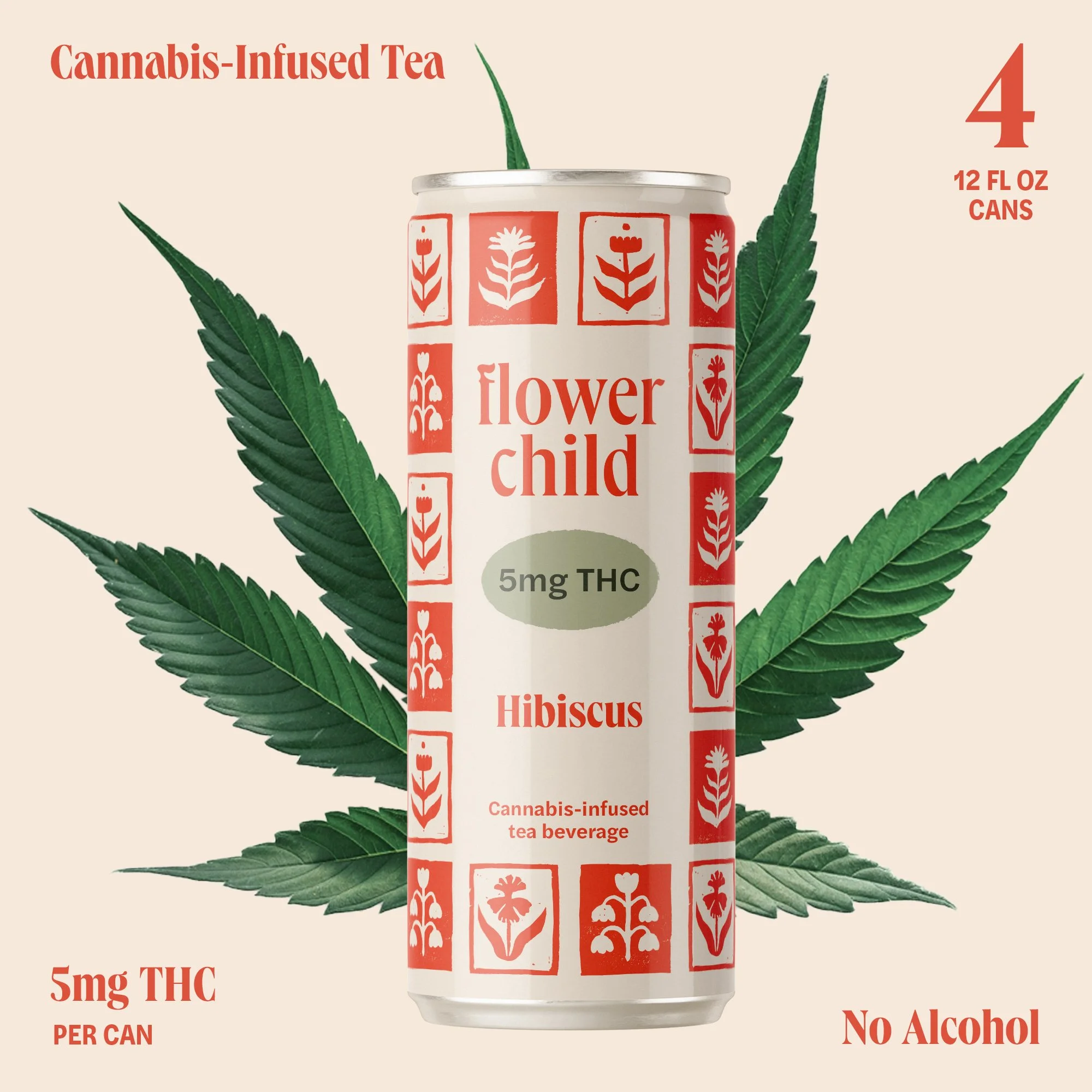

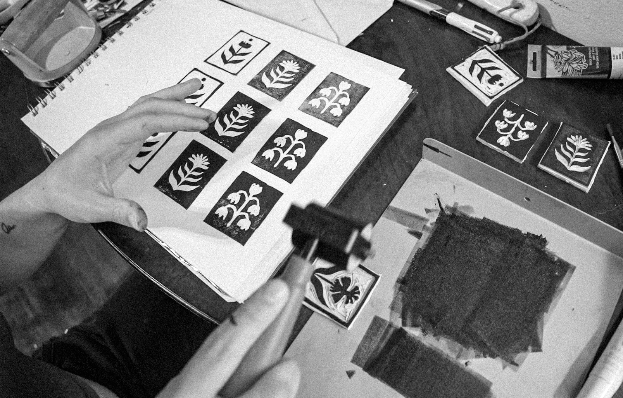
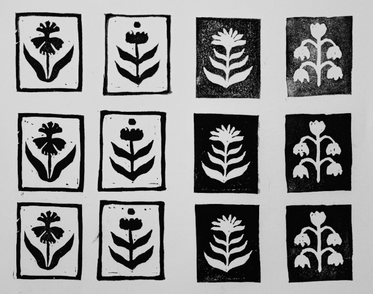
ILLUSTRATIONS & PATTERN
The checkered flower stamp pattern was created by linoleum printing the designs and scanning them in to vectorize them. The slight imperfections of the linoleum printing technique add more character and a hand-made, organic feeling to the packaging design.