Homebase
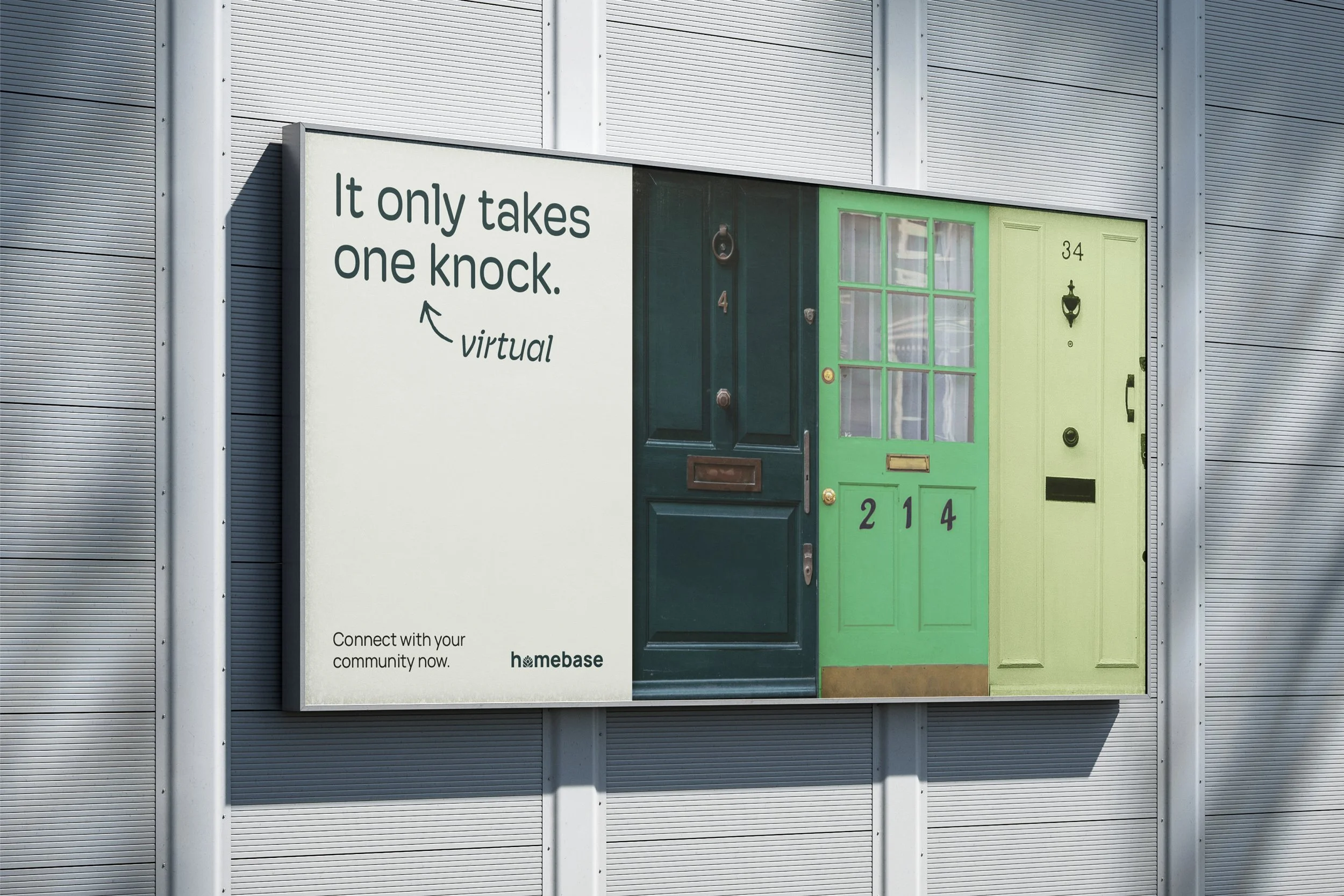
Homebase, a conceptual brand, is a digital platform that locates resilience hubs and other community resources and makes it easier to form relationships with neighbors, facilitate mutual aid, and work together towards neighborhood sustainability goals. As a competitor of brands like Nextdoor, Homebase needed to stand out as a resourceful, trustworthy, and easy-to-use platform focused on community-led sustainability.
The design solution was an inviting and trustworthy visual identity that inspires people to connect and engage. The widget-style interface makes it easy to navigate, and the language and visuals are bright and encouraging yet grounded.
Role: Art Director, Designer, Strategist, Illustrator
Visual Identity Design Brand Strategy Illustration Mobile Design Logo Design

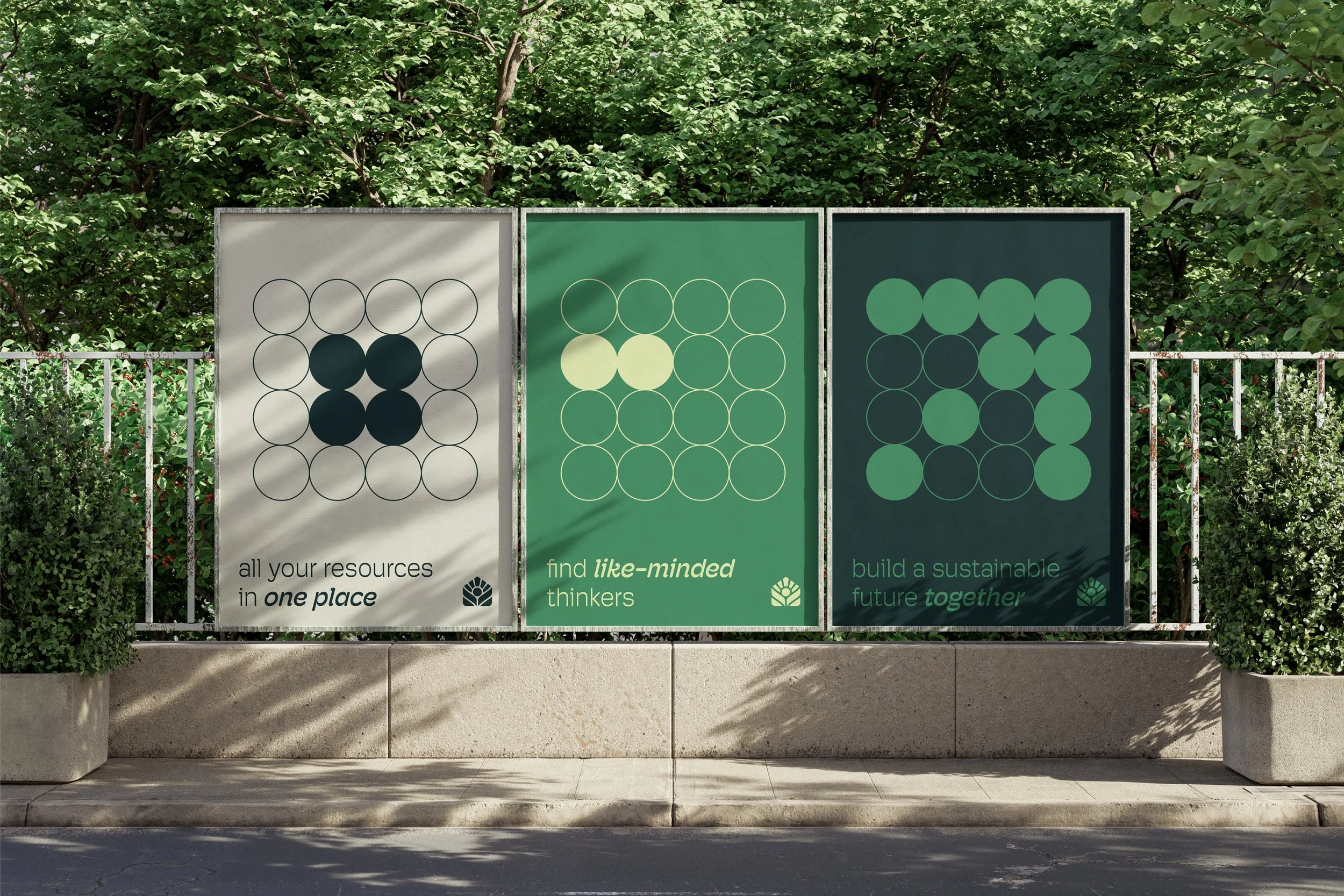


LOGO & PATTERNS
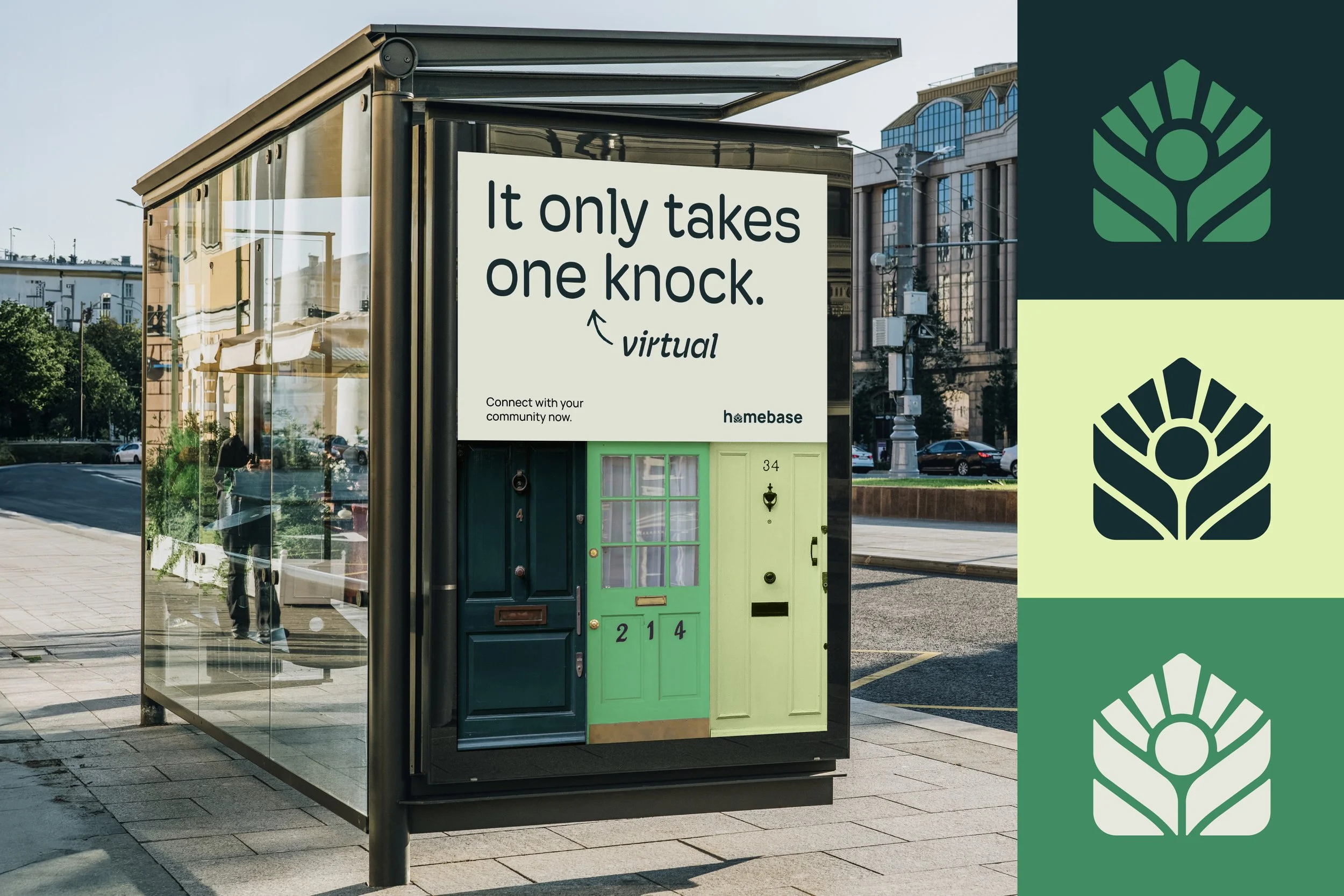
The logo combines the symmetrical and geometric features associated with a tech brand while simultaneously alluding to nature and the home. Abstract representations of plant leaves and sunlight are embedded within a house shape, or “homebase” plate. The simple circle grid pattern borrows from the circle in the logo and shifts to represent individuals coming together to build resilience and centralize their resources.
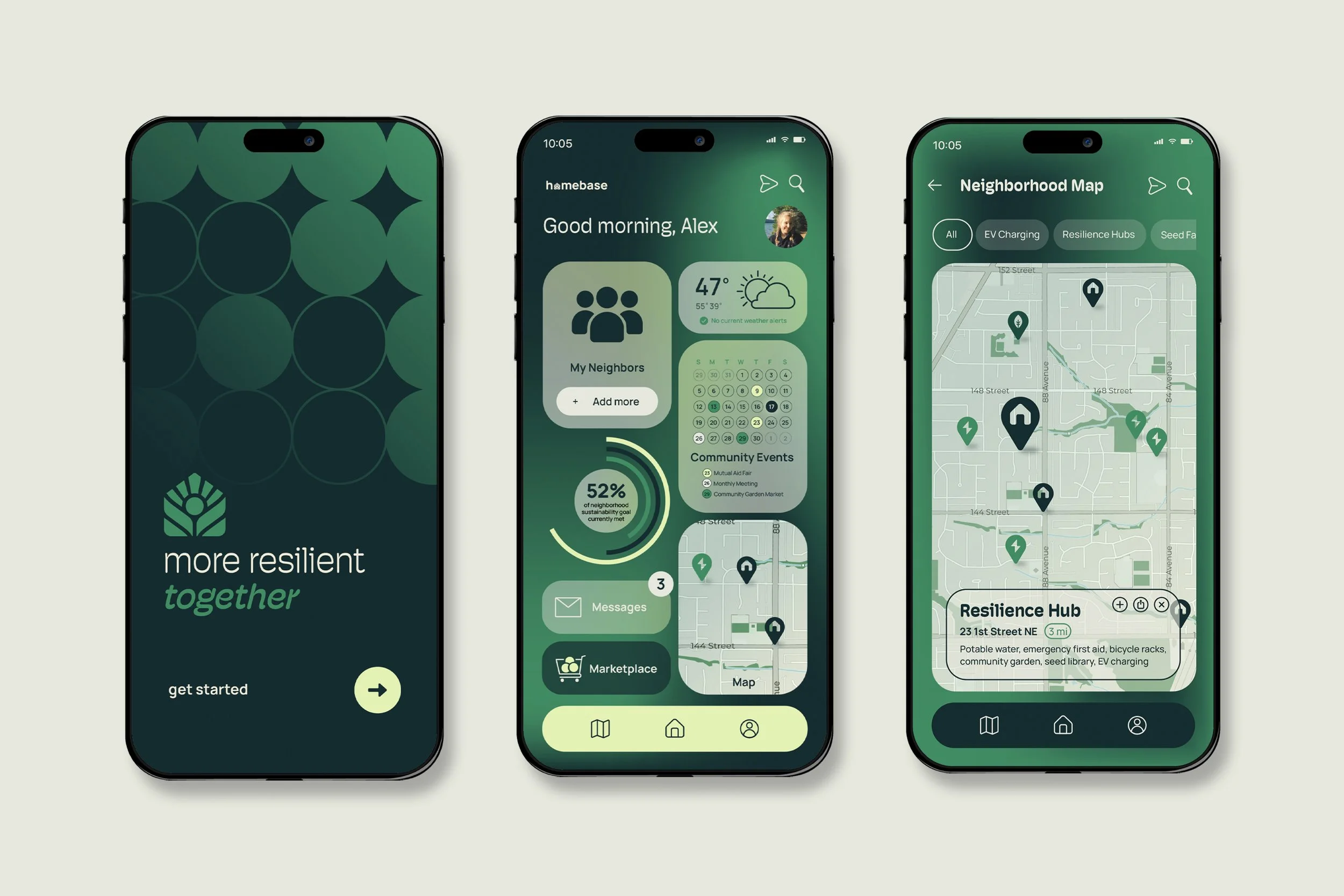
APP INTERFACE
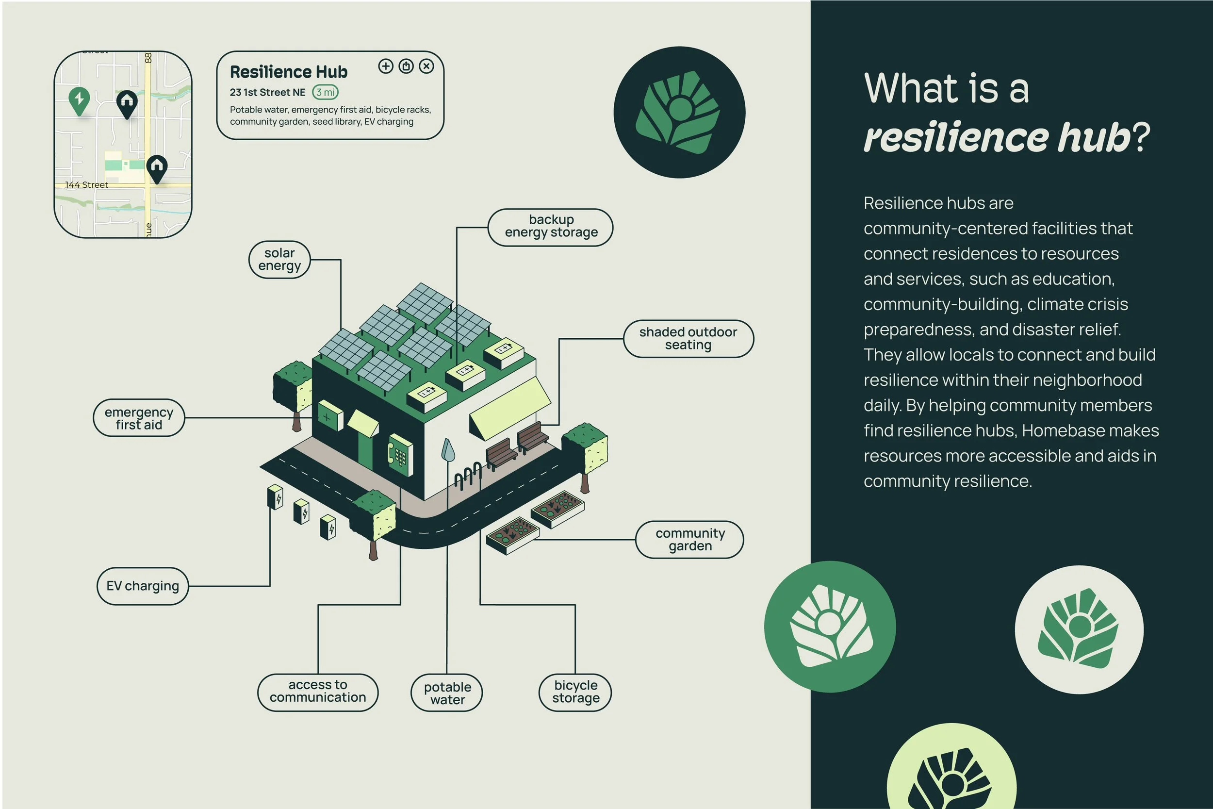
A widget style for the mobile app makes the user interface approachable and engaging, allowing neighbors to easily connect with one another and track their neighborhood sustainability goals together. The map allows for hubs and other resources to be located and navigated to quickly.