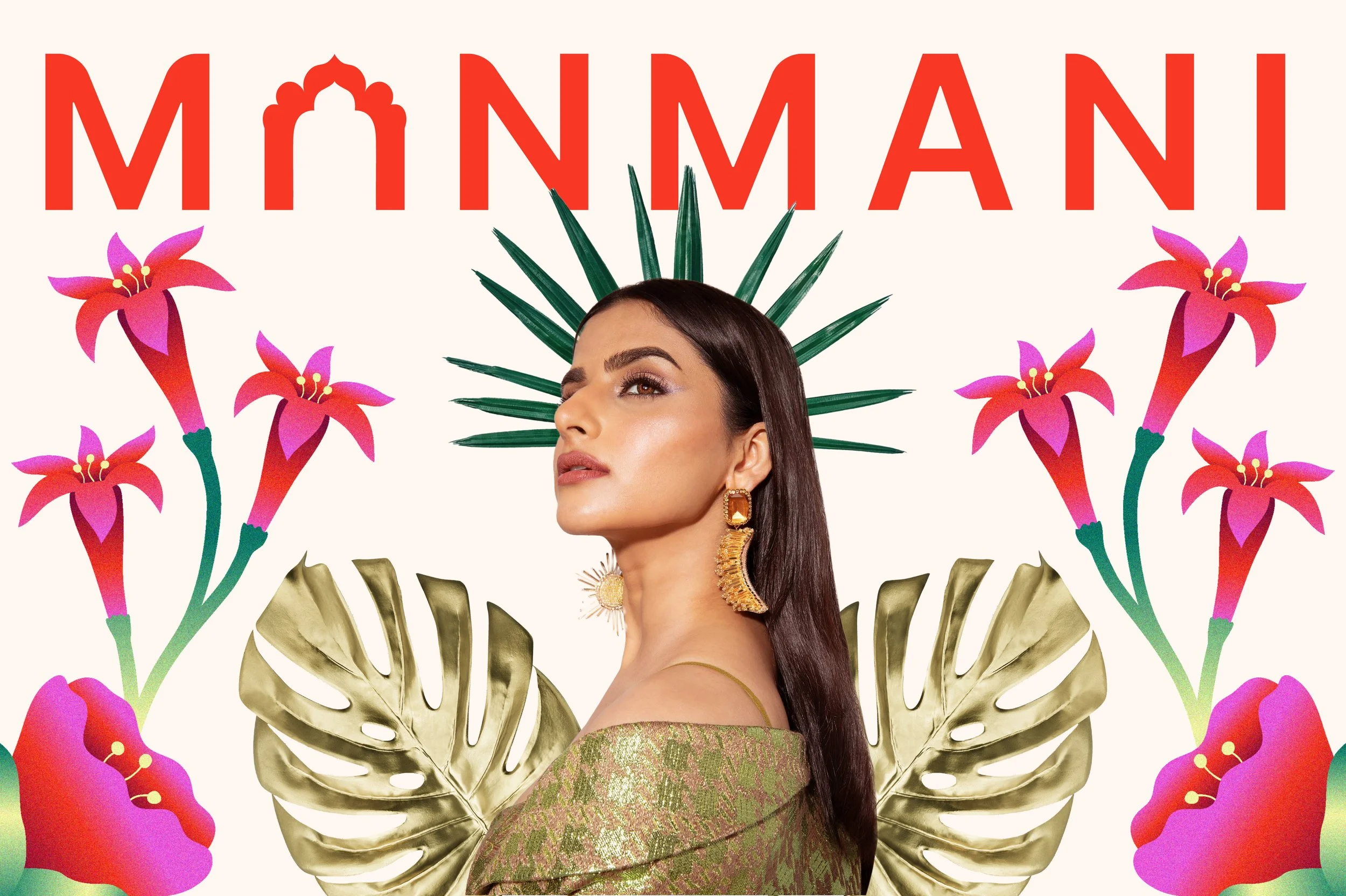
Manmani
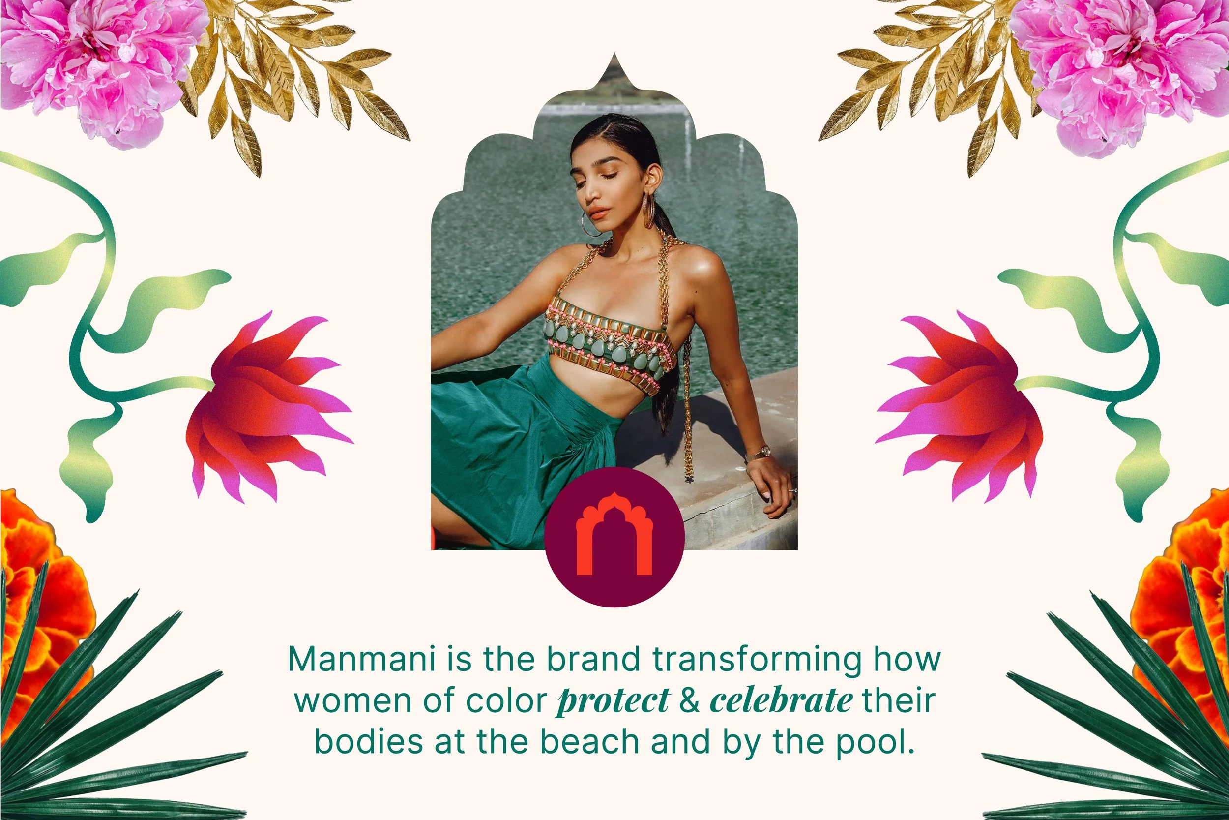
Manmani, meaning “to be willful and wild,” is a sustainable & ethical swimwear brand transforming how women of color protect and celebrate their skin. Manmani needed a visual brand identity that aligned with its bright, empowering messaging while also maintaining an elegance, maturity, and touch of magic. They wanted the visual identity to allow the brand to connect with its community, beyond swimwear, about skincare and health.
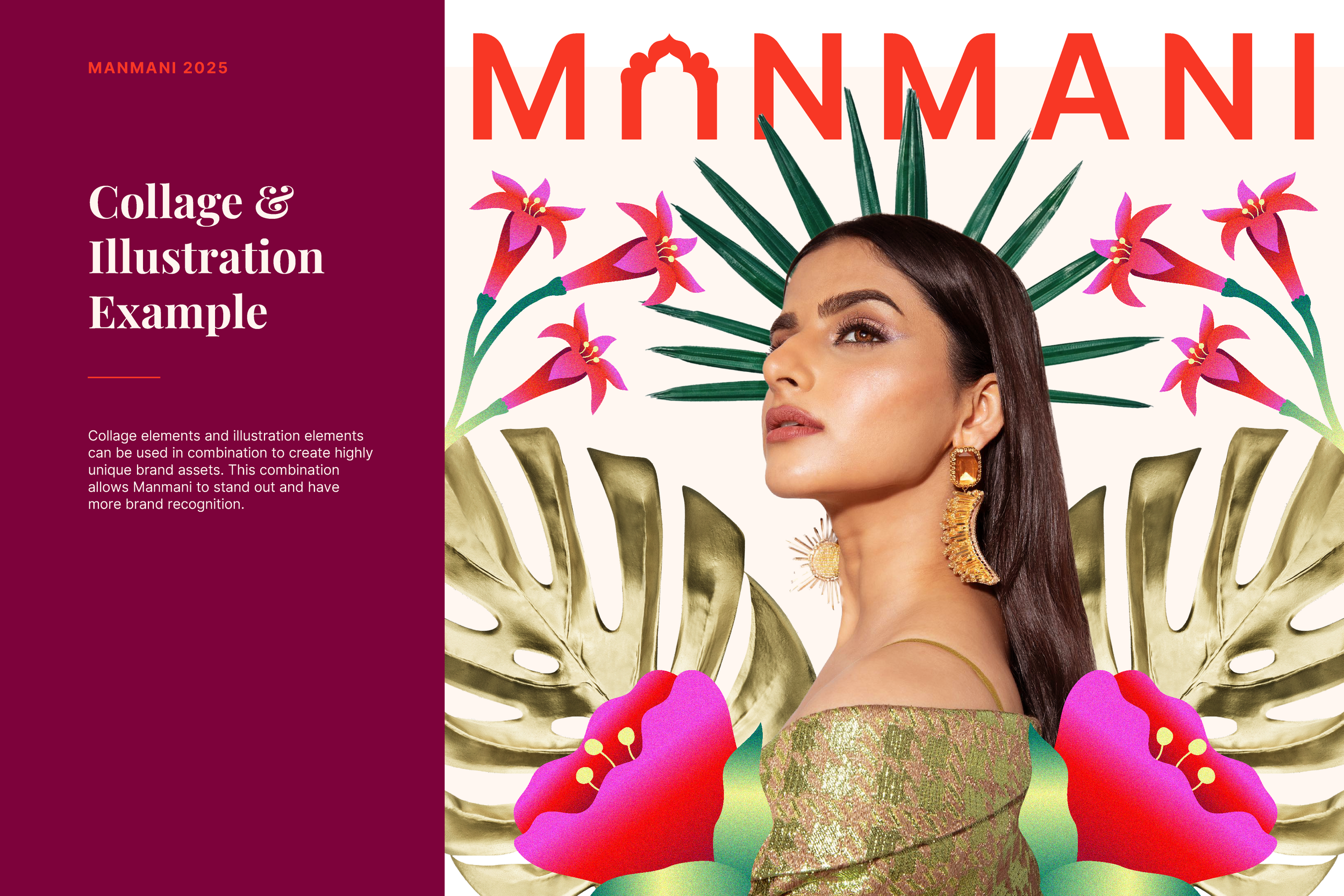
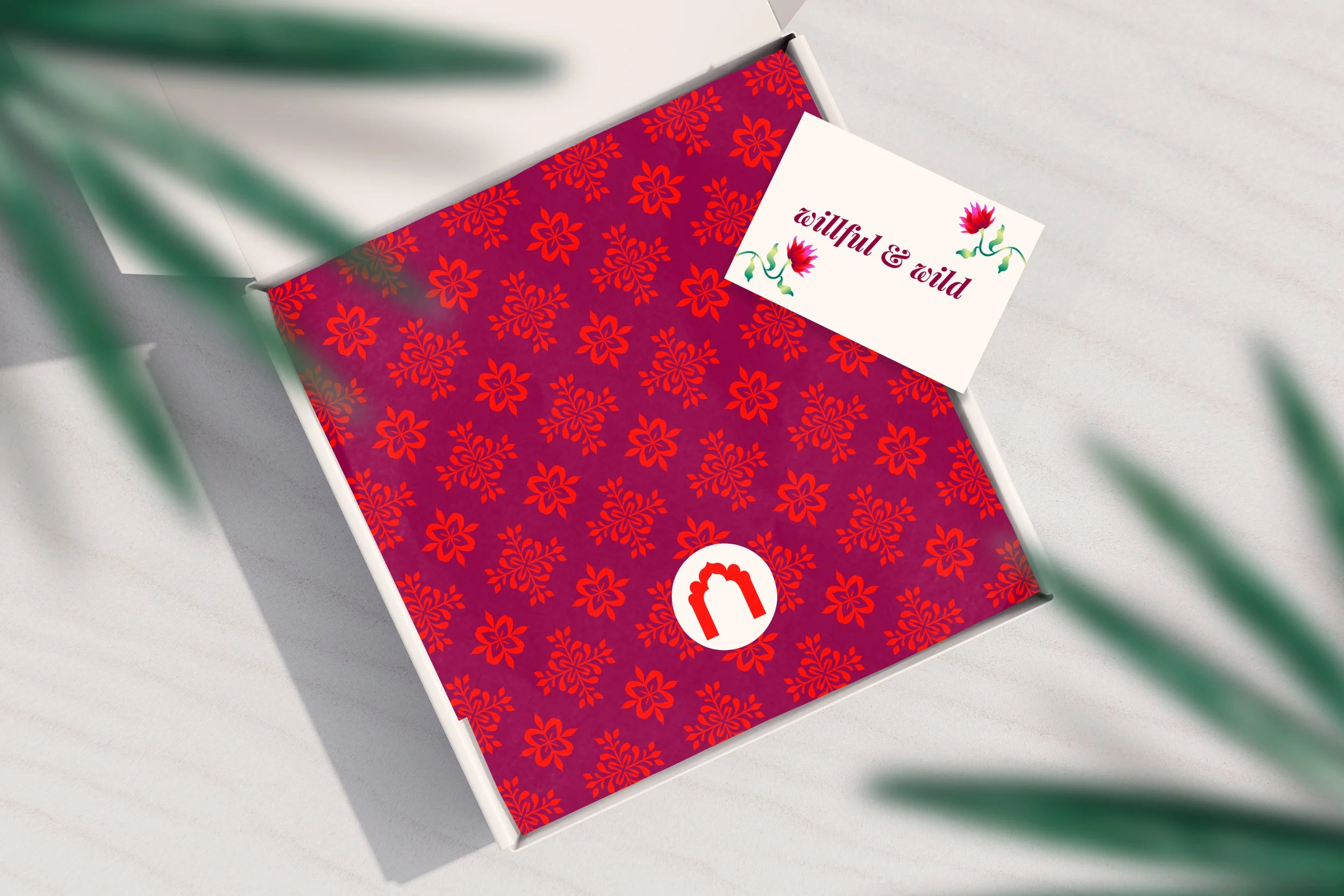
That shows up in a refined, balanced look with colors and elements inspired by Indian culture, infusing the founder’s cultural background into the brand. The blend of floral illustrations and collage elements creates a distinct, lush look. Surreal elements like clouds and sparkles inspired by Indian textiles add a hint of magic and immerse the customer in the Manmani world.
Role: Art Director, Designer, Strategist, Illustrator
Art Direction Design Strategy Illustration Web Design

LOGO
The logo takes inspiration from Indian architecture, and its symmetrical shape and exaggerated curves give it a playful yet grounded elegance. The corners of select letters in the word mark are rounded to mirror the archway symbol, embedded as an “a,” and to soften the overall look.
FONTS
Playfair Display adds a mystical touch, swirling around in the italic emphasized words, while Inter keeps it all grounded.

COLOR PALETTE
Rich gem tone colors and brighter neons help Manmani stand out from other swimwear brands and achieve a bold look that matches the luxury price point of small-batch swimwear. The palette nods to a tropical landscape while staying anchored by the deep burgundy.
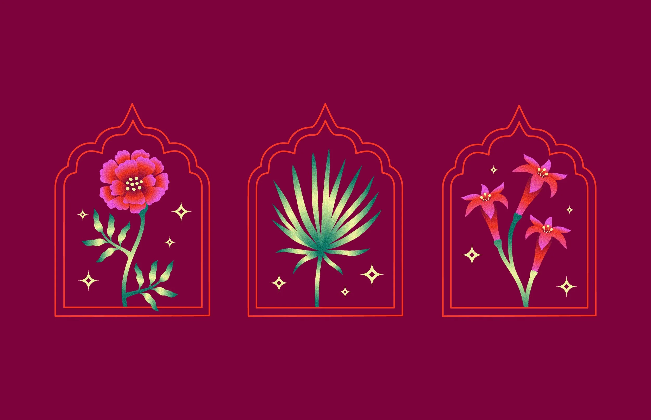
ILLUSTRATIONS
The illustrations use a grainy, gradient shading to add to a magical surrealism of the brand, while incorporating both tropical plants and flowers commonly found in India and other parts of South Asia. They compliment and thus can be combined with photo-based plant imagery and collage elements to create a unique, recognizable visual system.
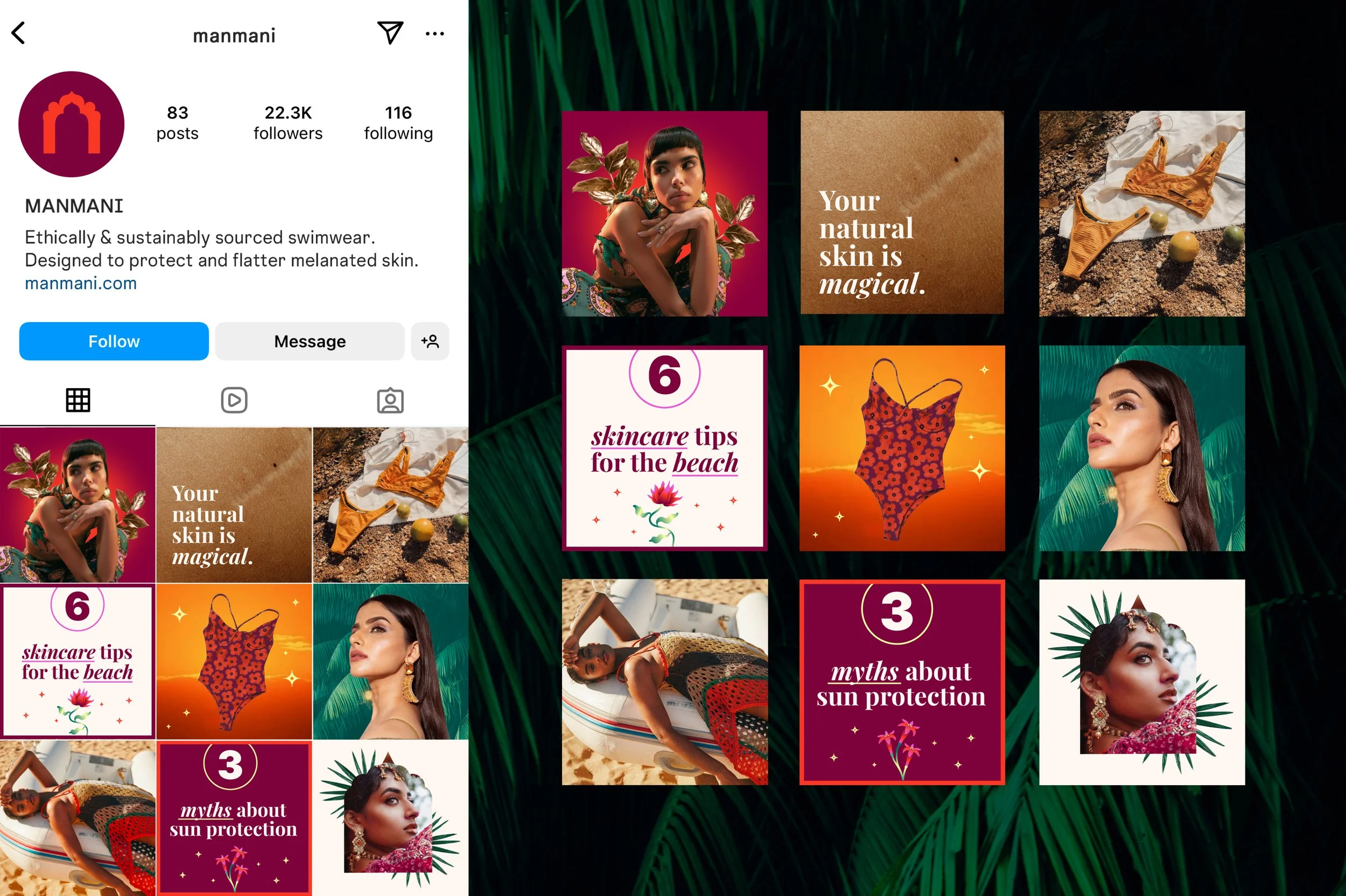
SOCIALS
The social feed contains a combination of infographics, or “save-able” posts, as well product photography and mixed-media collages that balance educational, community-oriented content with brand love and hype.
WEBSITE POP-UPS
We infused as much culture as possible as well as some playfulness into the the pop-ups. The sign-up pop-up is a play on words, telling people to sign up for all the “tea” (chai), a cultural staple of India. A cookies pop-up references the butter cookie tin used as sewing kit, an item that’s ubiquitous in immigrant households. These small details invite customers in playfully to connect with the cultural foundation of the brand and create a magical, recognizable brand experience.
Brand Guidelines (Sample)